Monique Mulder-Wallace Pottery
branding
graphic design
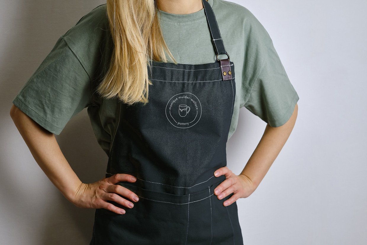
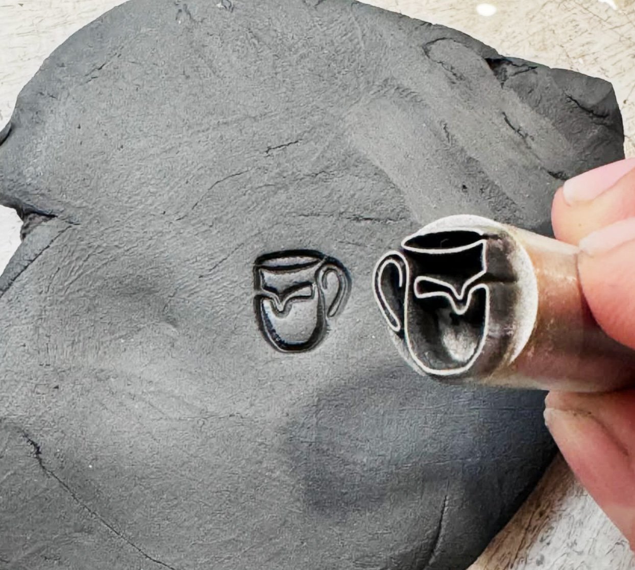
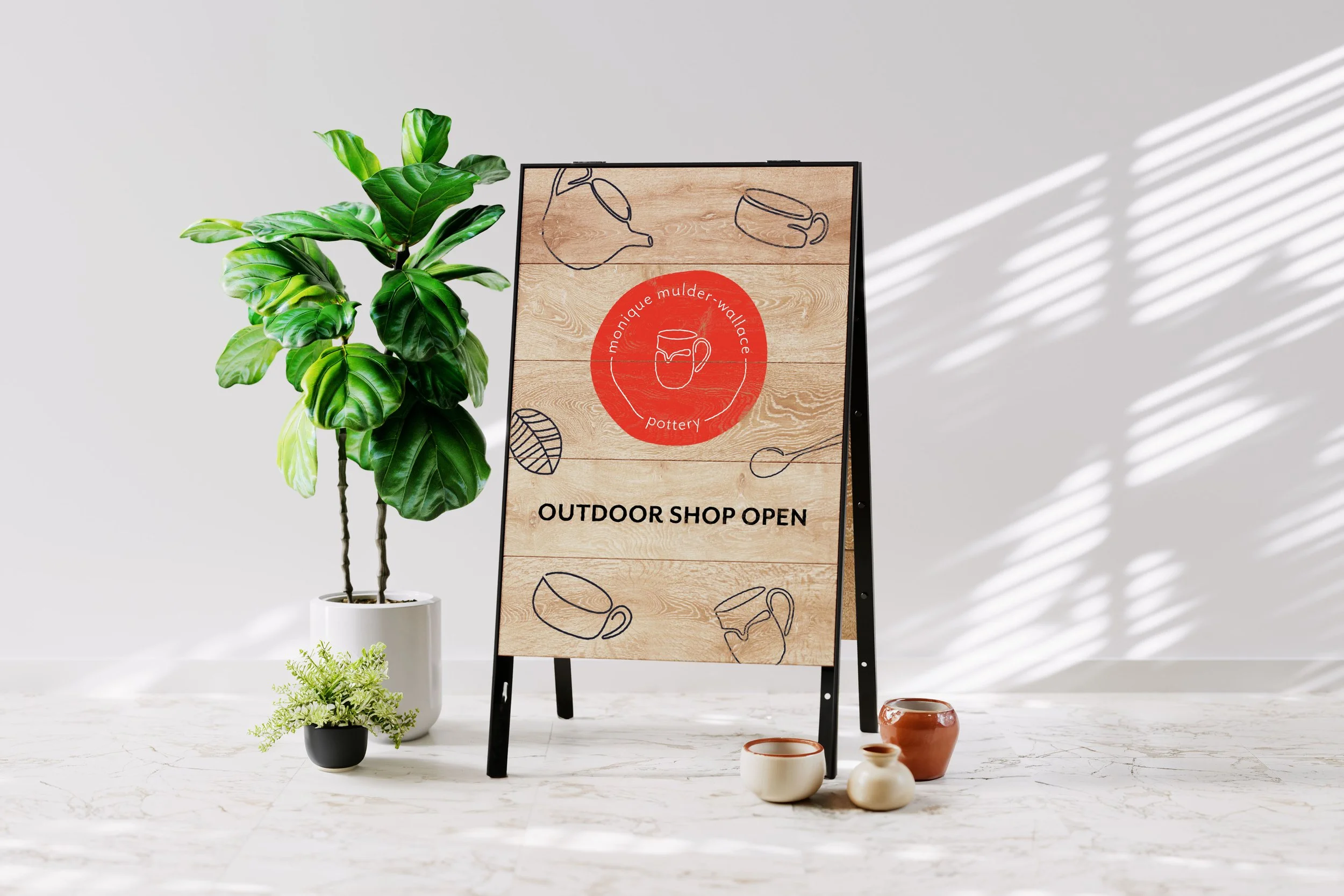
Monique wanted a logo that matched her moto; “imperfection is really perfection in the right person’s eyes”. In pottery it is very difficult to achieve a uniform product, and it also begs the question of why should it be? Each piece is unique and tells a story. My favourite part of going over to her place for tea is picking my mug, a tradition in many households. We used Monique’s signature mug as inspiration for the branding, which led us to create a presence that is unique, fun, and inviting.